So far we have been exploring the technical aspects that make for a good picture. The knowledge and understanding of the concepts behind a good exposure, are the foundation of photography, the tools to translate a concept into a good photograph. What we will be analyzing next, is the more elusive and ethereal – artistic, if you wish – substance of a photograph, which is its composition.
Composition is the single most important ingredient when creating an image. This is because it determines not only who or what the main subject of the image is, but also the contributions from every other element in the image.
Now, a word of warning first. Composition is a very complex topic, as it really digs deep into aesthetics, human cognitive processes, biological and cultural influences, and more. We will try and hint here and there to some of these, while maintaining a more practical approach.
What is composition
Composition is the structure of the image, the relationship among the elements that are in it. It is not just about what is in the picture, but also about how the different elements relate to each other. For example, is there a well defined dominant element? How about other elements in the image? Do they reinforce the importance of the main subject or do they detract from it? Does it all come together to tell a story or is it just a collection of things and people that compete for attention?
We can draw a parallel to the art of writing. The rules of language and grammar, somehow force us to use certain letters to form words, and certain words to form sentences that others can understand. When it comes to writing a paragraph, or a chapter, several sentences work together to provide a unified scene. Imagine how confusing it would be to read something like this:
She shrugs. “I was given my final pay at the anchor pad and he went away. Up and away”. Two boxes. Box A contains one hundred balls: fifty red and fifty black.
You can easily find a discontinuity in that paragraph. It’s not unrealistic to think that, at the location where she shrugs, there might very well be two boxes with colored balls in them. Yet, something doesn’t add up, and we do not like it. Same goes for images: if we can’t make sense of the scene, we won’t like it. We need to learn to read an image.

Reading an image
When an image is presented to you, your eyes will scan it, trying to quickly find the main subject. This will be identified by several means: its size inside the photograph, its clarity, luminosity, contrast, color. There are also other elements that can guide your eyes toward the subject. Perspective, lines, gradients of color or light.
The first question to ask, when composing an image, should be: what story do we want to tell? Where do we want the eyes of the viewer to wander? What emotions do we want the viewer to feel?
When we read a book, our eyes follow chains of words, line after line, page after page. Each new sentence adds to the story or concept, and refines it.
The same goes with photographs. Instead of words, we have shapes, lines, and points.
Rules of composition
Many rules intervene in the combination of shapes, lines and points, and they can convey very different emotions. For example symmetry, conveys stability, centrality, power, importance. Rhythm and repetition, give a sense of order and predictability. It can create a sense of perspective, and can also direct the viewers eyes. Ratios, like the rule of thirds, produce powerful relationships among elements in the image, guiding the eyes from one element to the other until they all converge to the main subject.
Composition tips
There’s quite a lot more about composition, but many books have been written about this, and by experts in the matter. Check our book suggestions below for some pointers. We will now focus on nine practical tips that will help improve your images.
1. Horizontal horizons
Images where the horizon is in sight, should be taken dead square, making sure the horizon is in fact horizontal. This is also true for vertical lines: if something should be vertical, make sure you align that before you take the photo. Now, there’s many situations where that isn’t easy, or possible. Be aware that simply relying on post production to rectify the issue, will cost you some clarity. Also, rotations will lose wedges of content, and your final composition may suffer. So, try to spend some extra moments and align the camera correctly, and in some cases, zoom out a little, and leave a little more room for rotation.

2. Rule of thirds
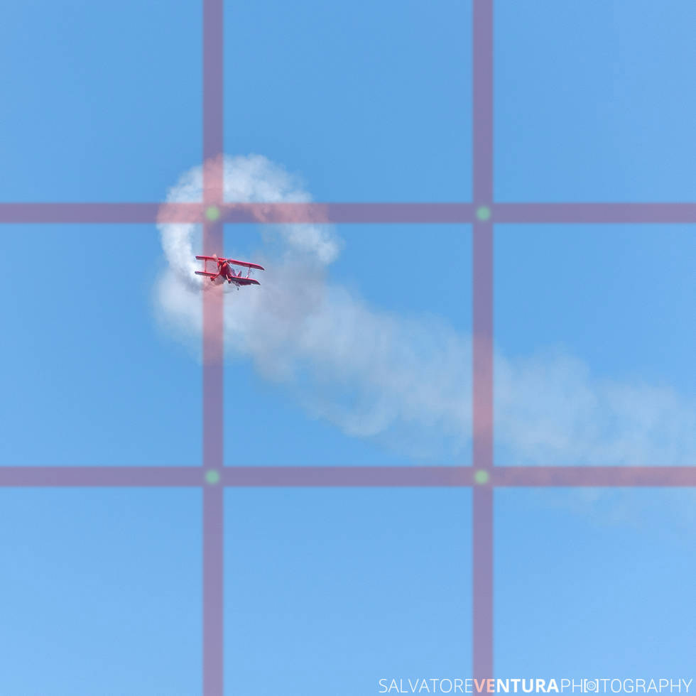
With the rule of thirds you divide your image in 9 imaginary quadrants. To do that, you will have two parallel vertical lines, intersecting two parallel horizontal lines. The four points where they intersect are called by some power points. These points have a very strong aesthetic appeal, so try to position there key elements of the scene. Each of the lines is also a very powerful guide. For example, you can overlap there the line of the horizon, leaving more room to either the sky or the sea or land. Or you can use the vertical lines, to align the position of a person, or a tree on the scene.
3. Clean backgrounds
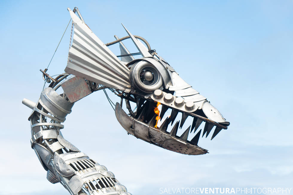
Being aware of the background can be very rewarding. This goes hand in hand with the ability to isolate your subject and make it pop. Sometimes you really have to work the shot to finally find the right background. You may need to move the subject, or your angle; change your perspective (go higher or lower); use a different focal length or simply get closer. There really is no rule to this, and the skill to cleaner backgrounds really comes with practice.
4. Fill the frame
Avoid or reduce empty space around your subject, unless – of course – the empty space is the subject. Often times you can get far better compositions and more interesting images, by zooming in closer, and just keeping the relevant parts of what made you take the shot in the first place. It makes for a more direct and personal connection between the viewer and the photo, and indirectly you, the photographer.

5. Framing
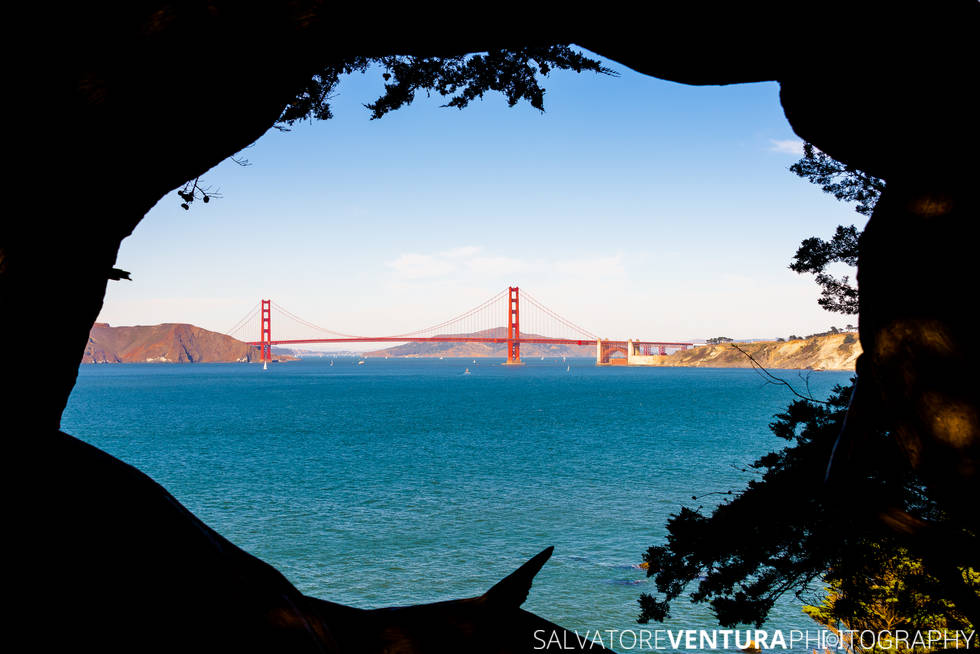
Framing is when you allow foreground elements to frame or enclose the scene that develops further away. It works in multiple ways, and generally helps by adding more sense of depth, or by pulling back the viewers eyes onto the main subject. Next time a tree or a bush is too close and you can’t seem to be able to avoid it, see if you can actually include it in the shot as integral part of the composition.
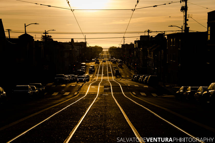
6. Leading lines
If the scene has lines that converge to your subject, you can take advantage of those to help draw more attention to it. It can be a handrail, a crack on a wall, the outline of a stairwell: anything that guides the eyes towards your main subject works to your advantage.
7. Match your subject’s height
When you match the height of your subject, you get a very direct and intimate view of their world, hence your images acquire a more personal dimension. This is especially true for children and pets: just get low, and become their peers.

8. Hunt for details
Spotting the little things is sort of a photographer’s dream, right? It obviously takes practice, a good eye, and also a pinch of luck. But there’s plenty of opportunities to get an extra shot and make an interesting image out of an ordinary scene. Just look closely.

9. Vertical shots
Vertical pictures are as interesting as horizontal ones. Some subjects or scenes just work naturally better in vertical mode, so don’t be afraid of trying. Matter of fact, shooting everything both horizontally and vertically could be a very rewarding exercise, so give it a try!

Conclusions
When you take a photograph and show it to somebody, they are expecting to see what you photographed, and also understand why you took that picture, what really made you click the shutter. That is the intent of the image, the story your image should be telling.
The recipe for a great image resides on its composition, the relationship between the elements around the main subject of the photograph. Improving composition takes exercise and practice. Combining the tips and rules mentioned above, can be a very rewarding journey towards taking better pictures.
Other resources
Groom+Style has published a very complete and compelling post about Making the Most of Your Camera: check it out for additional tips!
If you liked this article, consider sharing it with your friends and use the referral links included when proceeding to a purchase. It helps me a lot, and does not cost you a dime.
Here are few book recommendations.
By using my links to buy/browse gear, you’re supporting my photography and articles.

