


Originally published 2014/03/06. Reposting with updates.
Today’s tutorial will cover a property called “saturation” and how its manipulation affects an image.
What is saturation?
Saturation of an image describes the separation between tones in a color. Highly saturated images have purer colors, thus appear more vibrant and lively. Less saturated colors give room to more shades of the same color.
Saturation is a color-only property: black and white images don’t have saturation. In fact, if you completely de-saturated an image, you would end up with a black and white image. But that’s not the best way to convert color to B&W.
Saturation and light
Saturation is directly affected by lighting. Direct light usually enhances saturation, while tones emerge with indirect and softer light sources. And of course, your subject should start with pure colors in the first place.
Saturation manipulation
You can see below the effects that manipulating saturation has on an image.
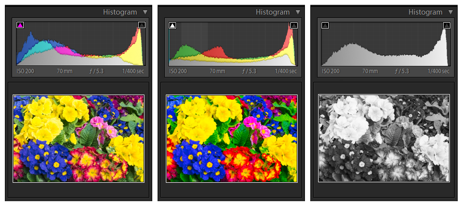
Decreasing saturation simply “washes” down colors, and is generally better tolerated than increasing it, as this can lead to unnaturally bad artifacts.
Saturation in Adobe Lightroom
In Adobe Lightroom, saturation can be modified in two modules, the Library and the Develop module.
In the Library module you have two controls, one called “saturation” and another called “vibrance”. The first one does exactly what you expect: increases or decreases the saturation of the image. The second does a similar thing, but has a milder effect on skin tones, thus it can be safely used to push colors in images that include people, without turning their faces into orange balloons (try it!).
The Develop module has a full set of sliders that allow to control both saturation and brightness of each color tone independently. This way, for example, you can increase the saturation of the greens without affecting the reds, or you could completely de-saturate every tone except for red and yellow.
Quick color tip
When some colors are washed out, modifying saturation is not always helpful to bring them back into the scene. In those cases, try to first decrease their brightness. Most of the times, it works better and if done with moderation it achieves a more balanced and natural look.
Summary
Let’s now summarize the key points around saturation that we have covered above:
- Saturation measures the separation between color tones
- Increasing saturation “pushes” the colors and makes them more vibrant and lively, with loss of mid tones.
- Decreasing saturation “washes” colors down, progressively leaving only the luminance of the image, which is black & white.
- Lowering brightness of individual colors may help bring them back into the scene, more than increasing saturation
Check out my other tutorials in the Education section!
